Avon Rebrand
Category: Identity Rebranding
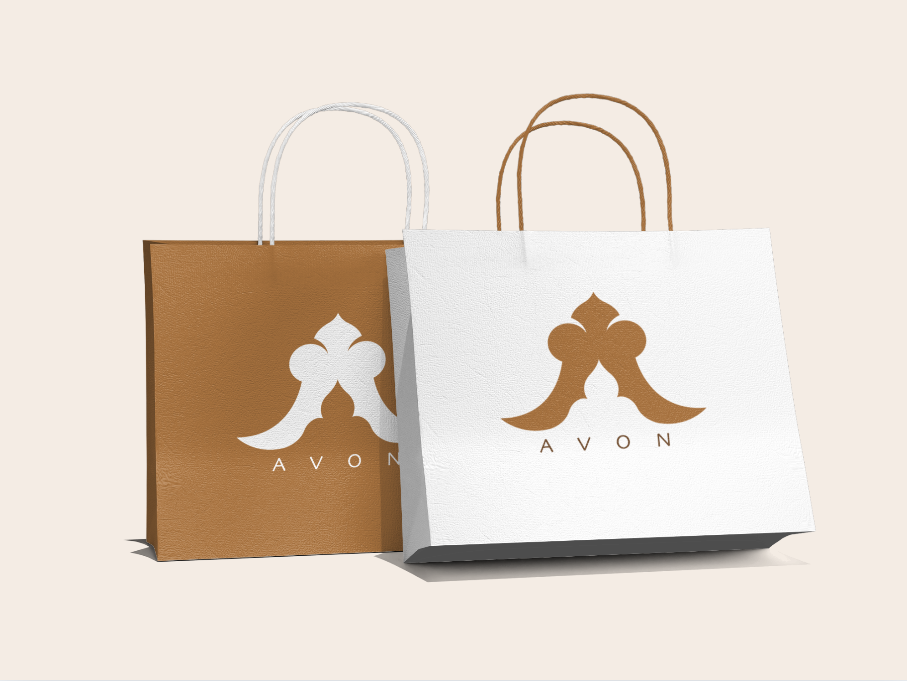
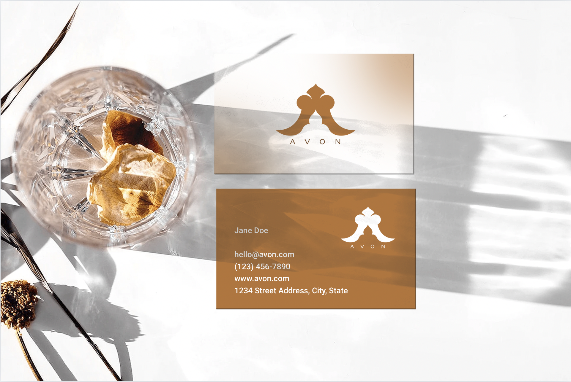
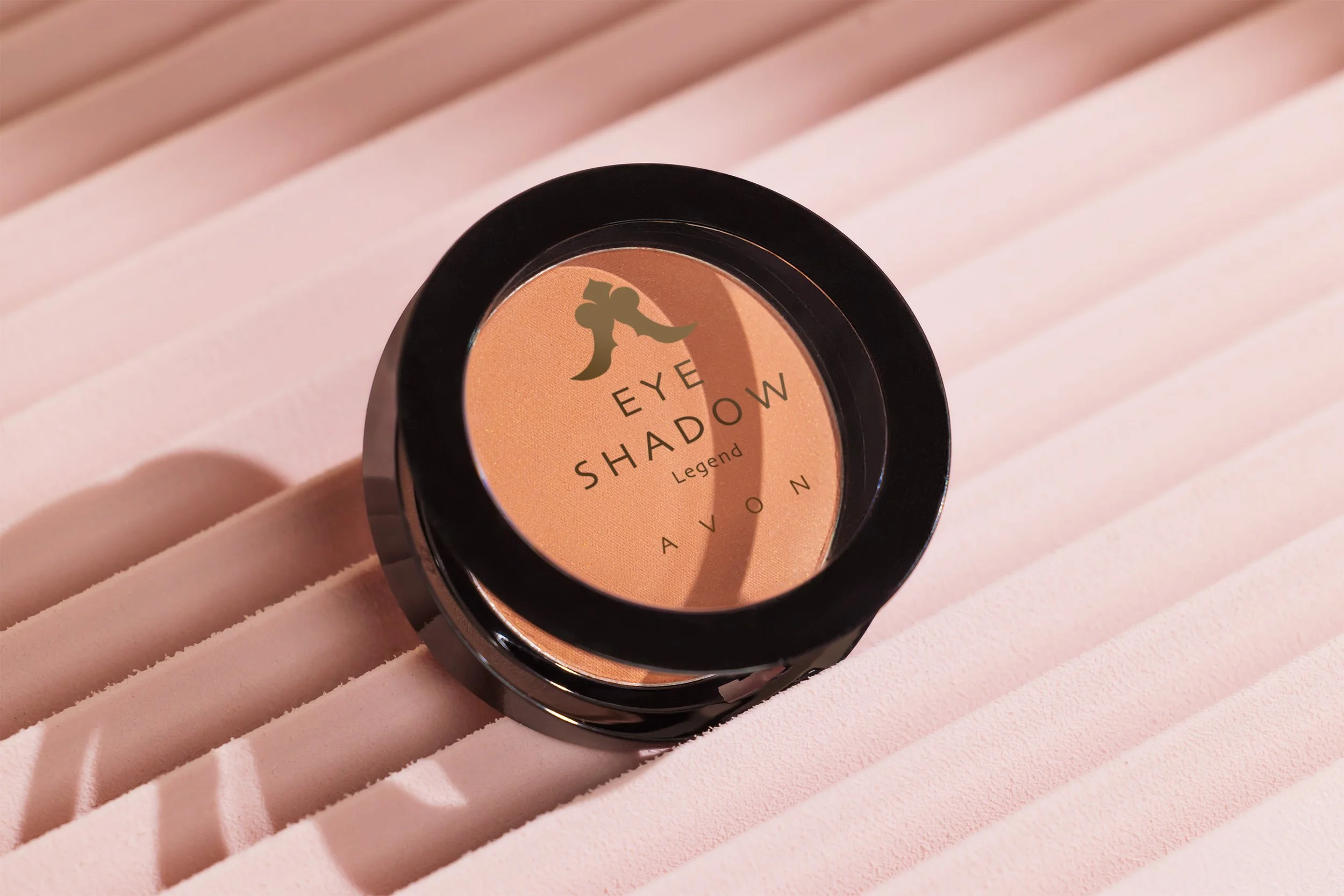
Components: Logo, business Cards, Packaging
Tools: Adobe Illustrator, Adobe Photoshop, Adobe InDesign
Avon Products, Inc. is one of America’s oldest direct-selling enterprises.For more than a century, Avon came to people's doors. The brand is famous but I chose to rebrand their logo and product aesthetics because, despite their strong name recognition, Avon struggles with a lack of contemporary relevance and the inclusivity at its core hasn’t been translated into their brand, visually.
To better align the company with the values of today’s consumers, I reimagined the brand’s direction: Everyone is welcome. It’s a safe haven. A revival of inclusive beauty within the brand.
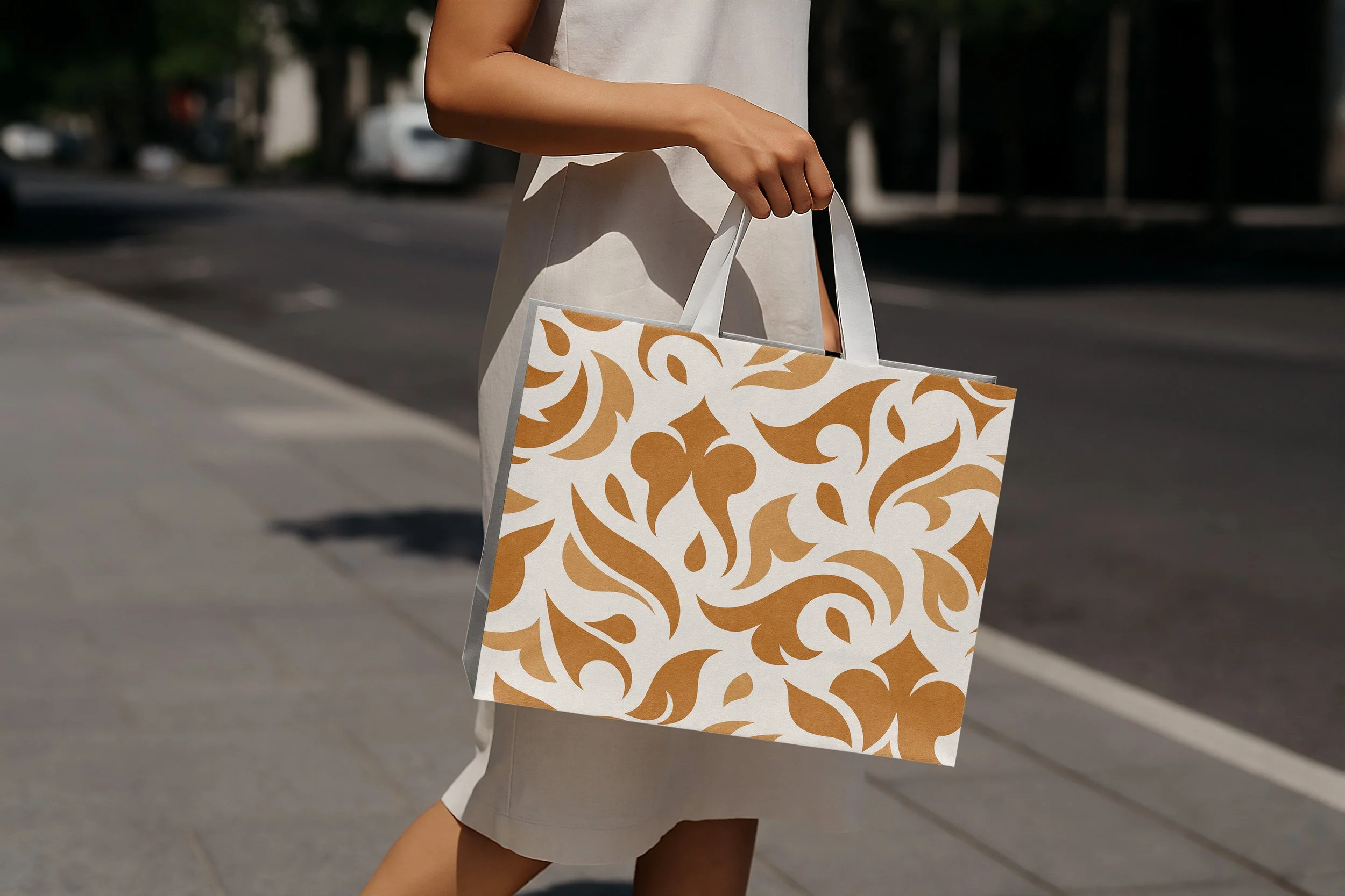
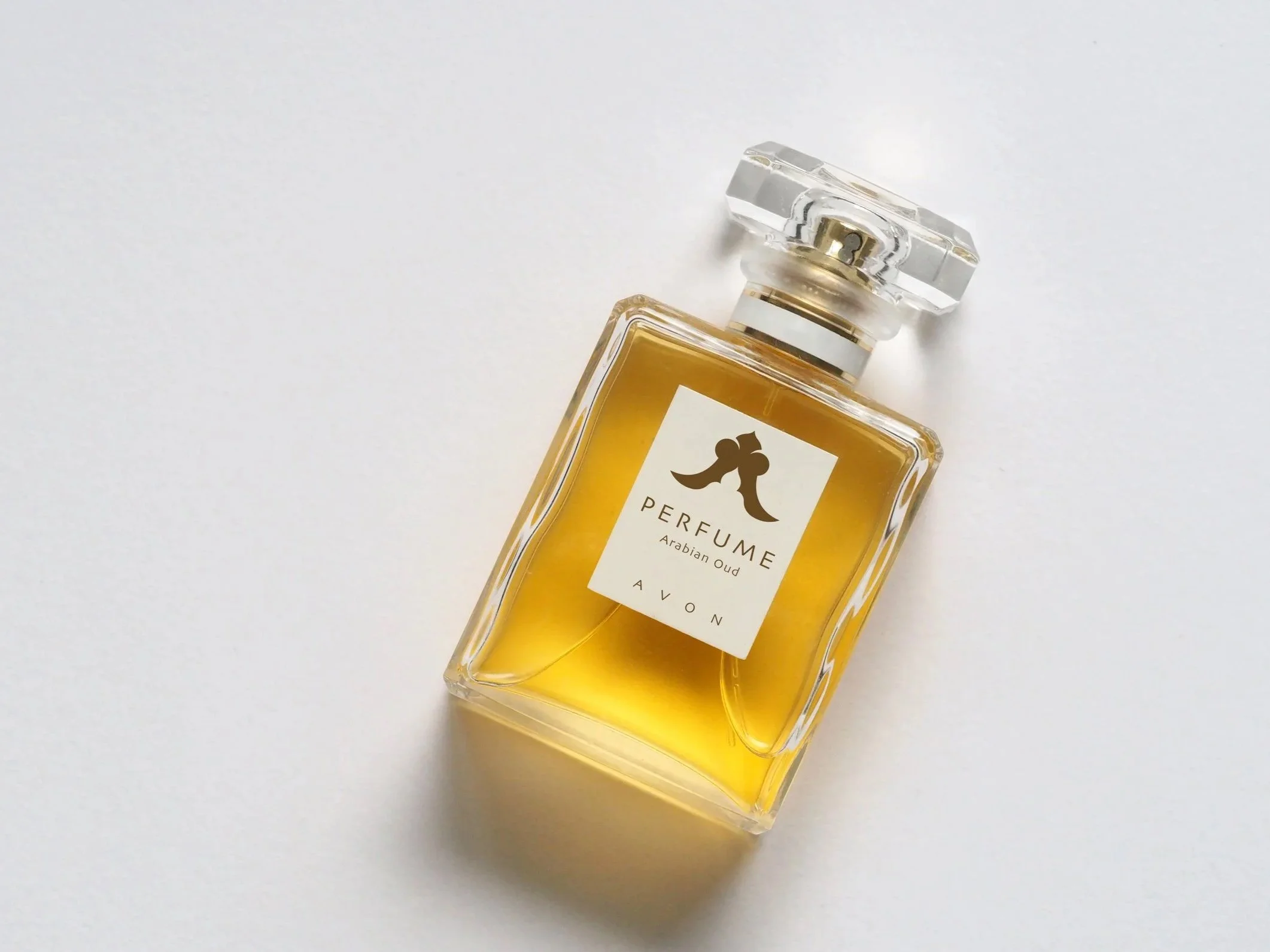
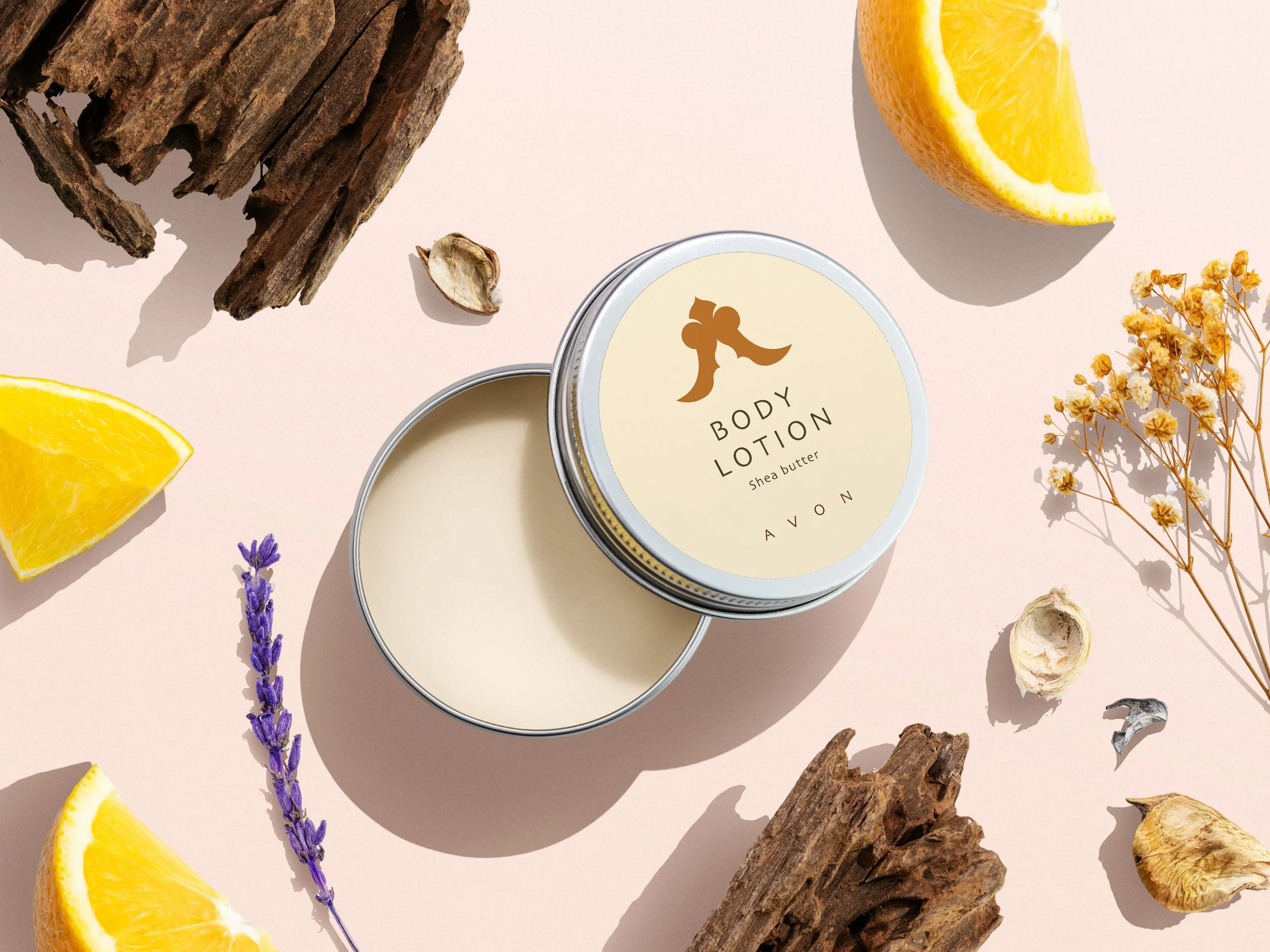
This rebrand reverses Avon's door-to-door heritage: Avon no longer knocks, it becomes the door. The mark is built around an open arch, a threshold that welcomes everyone in. Its two flared forms shape the letter A, and the ornamental crown nods to the brand's classical roots: the name Avon comes from Stratford-upon-Avon, Shakespeare's birthplace. Soft curves and a warm copper palette keep the identity premium but approachable, and generous letter-spacing gives the wordmark room to breathe.
INCLUSIVE BEAUTY
+
INCLUSIVE BEAUTY +